Projet d’étude :
Design d’information dans les transports publics parisien
2019Au cours des siècles derniers, les cartographes (qui sont en réalité les pionniers du design d’information) avaient pour mission de cartographier le monde en tenant compte de certaines terres inconnues. Ces espaces blancs où ils manquaient des informations étaient alors couverts par des illustrations fictives (des monstres des mers ou des îlots imaginaires) par nécessité de combler ce manque d’informations plus que par soucis esthétique.
Aujourd’hui, c’est tout l’inverse. L’accès aux informations ne fait que grandir, et c’est surprenant de voir les quantités de données que nous absorbons, parfois même sans le vouloir. Le design d’information ou “traitement graphique de l’information” est un terme apparu dans les années 1970 et traduit une science de préparation de l’information pour qu’elle puisse être utilisée efficacement par les êtres humains.


partie 2 (ENG)

partie 3 (ENG
[...]
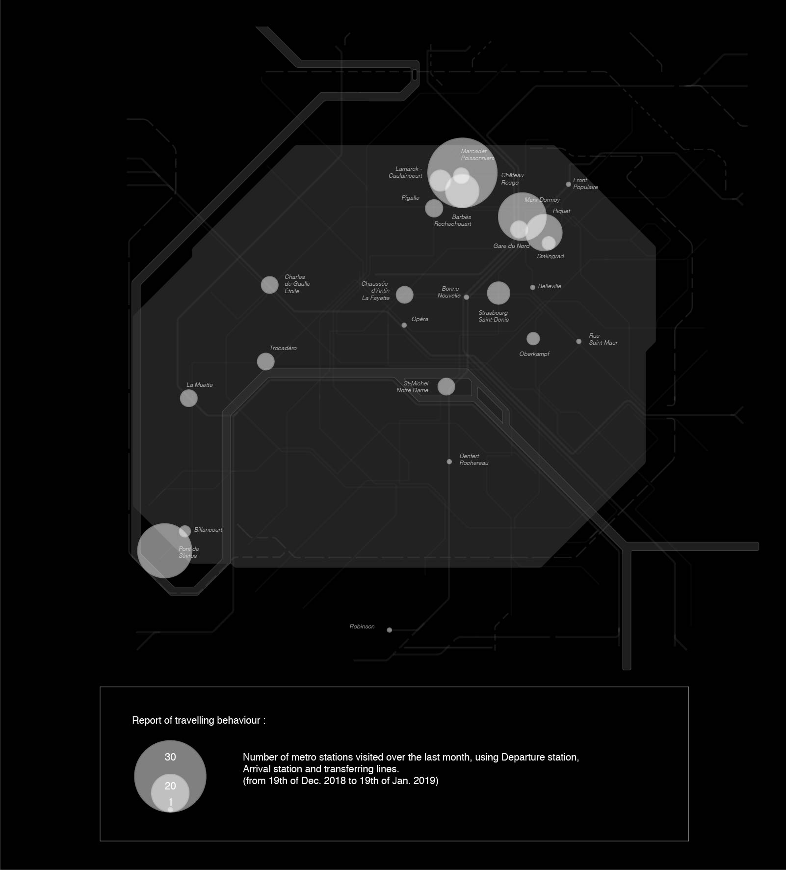
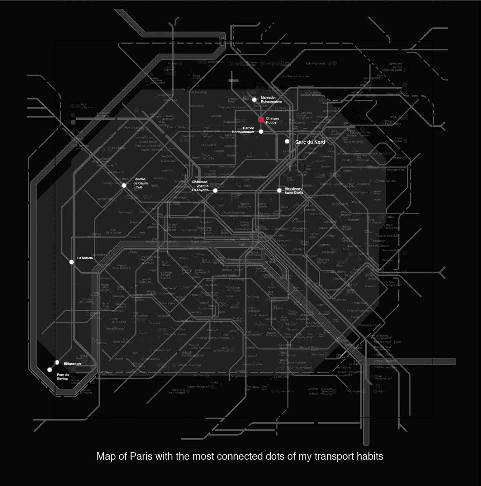
En tant que designer, je me pose la question de savoir comment simplifier la représentation cartographique du métro parisien actuel qui, je trouve, est devenue trop complexe.
La quantité de nouvelles informations grandit à une vitesse folle. Cela est en parti dû au développement des nouvelles technologies et à l’omniprésence d’Internet qui nous plonge dans un monde connecté en permanence. Nous sommes accablés d’informations tous les jours et il s’agit d’alléger la quantité d’informations qui sature notre quotidien.
Paradoxalement, on parle également de “smart-cities”, les “villes intelligentes” ou comment les technologies numériques se mettent au service des villes pour révolutionner l’organisation de l’espace urbain. Dans cette optique, l’usage des informations interconnectées pourraient en fait nous aider à mieux utiliser les transports publics - avec la question récurrente de l’effacement progressif de la voiture en ville.